An independent practice in digital product and brand design.

Aviator wordmark against a purple sky
Aviator

A vital identity for senior healthcare

Aviator

Overview

Aviator uses technology to rethink senior healthcare. For its identity and website, we wanted that approach to feel trustworthy and forward-looking.

We drew a mark that reads as both a rising A and the tail of a plane. The shape gives the brand a sense of motion, and a soft purple palette brings a little wonder to it. We carried that balance through to the website.

Client
Aviator
Role
  • Creative Direction
  • Visual Identity
  • Web
Year
2026
Aviator purple, lilac, black, off-white and white color palette
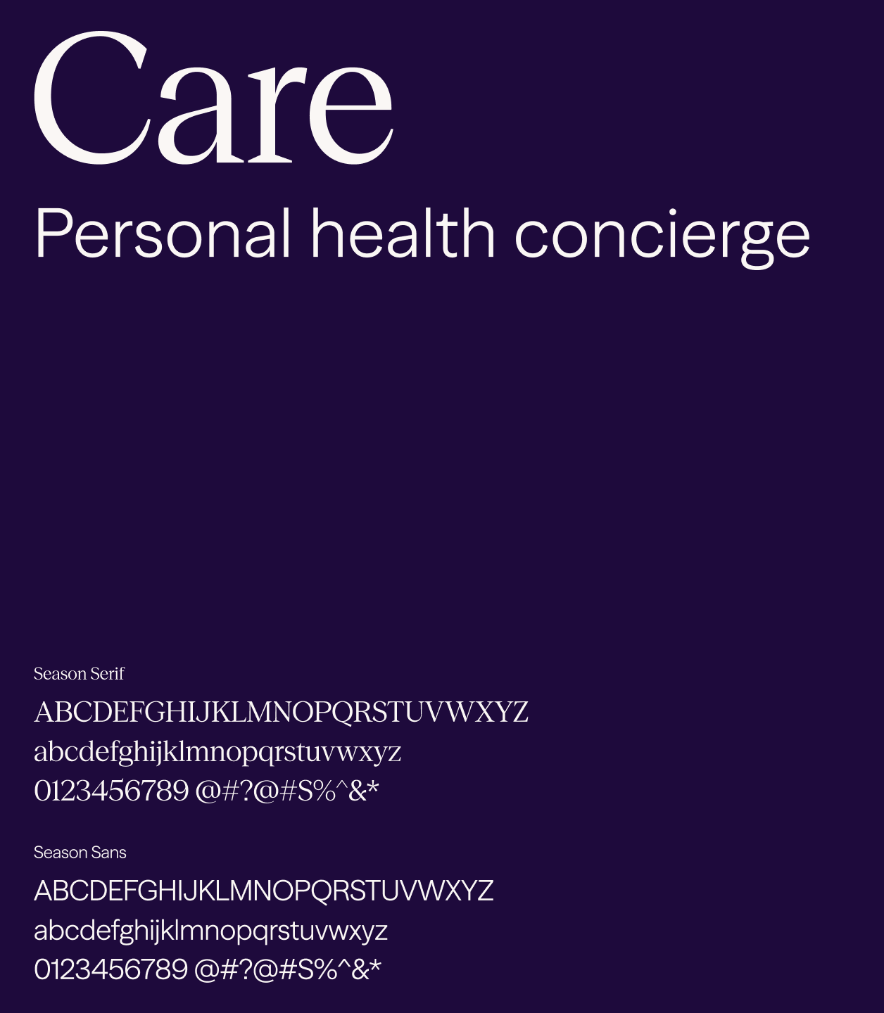
Aviator typography: Season Serif and Season Sans
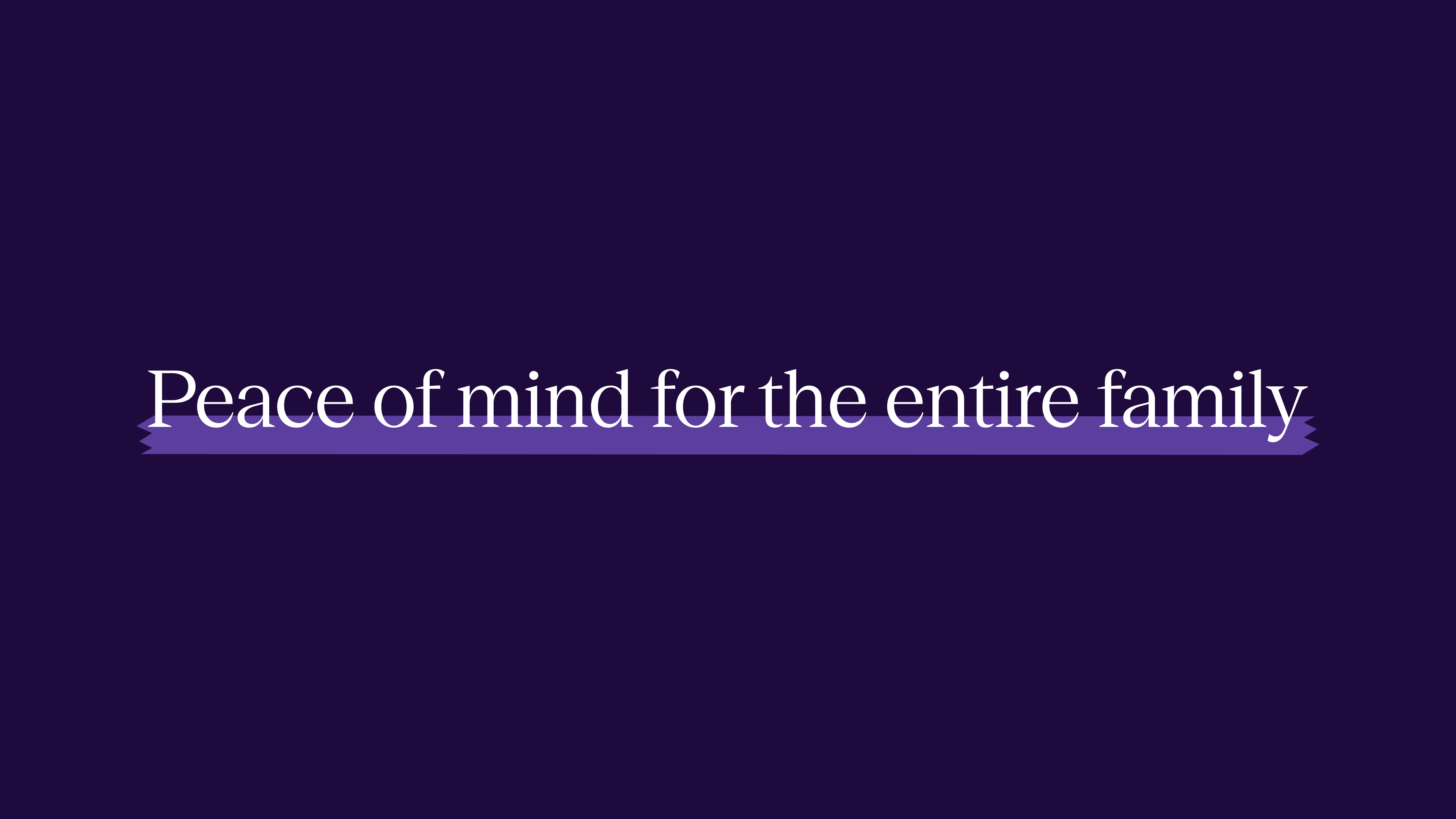
Peace of mind for the entire family, set in Season Serif
Aviator Health social profile on a lilac background
Aviator Advocate conversation and appointment scheduling interface
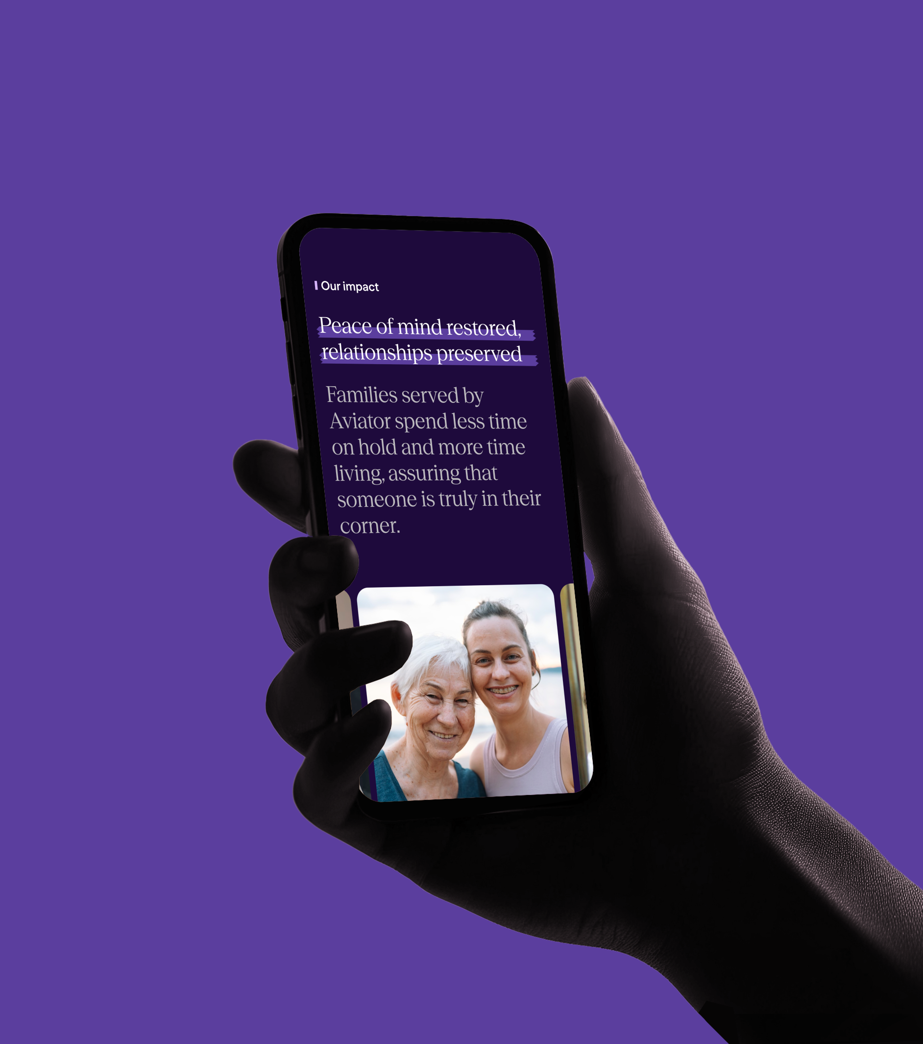
Aviator mobile website held in a hand
Aviator app icon on a phone home screen
Aviator photography direction: older adults and their families
Aviator identity on a purple water bottle
Aviator embroidered cap on a wooden shelf
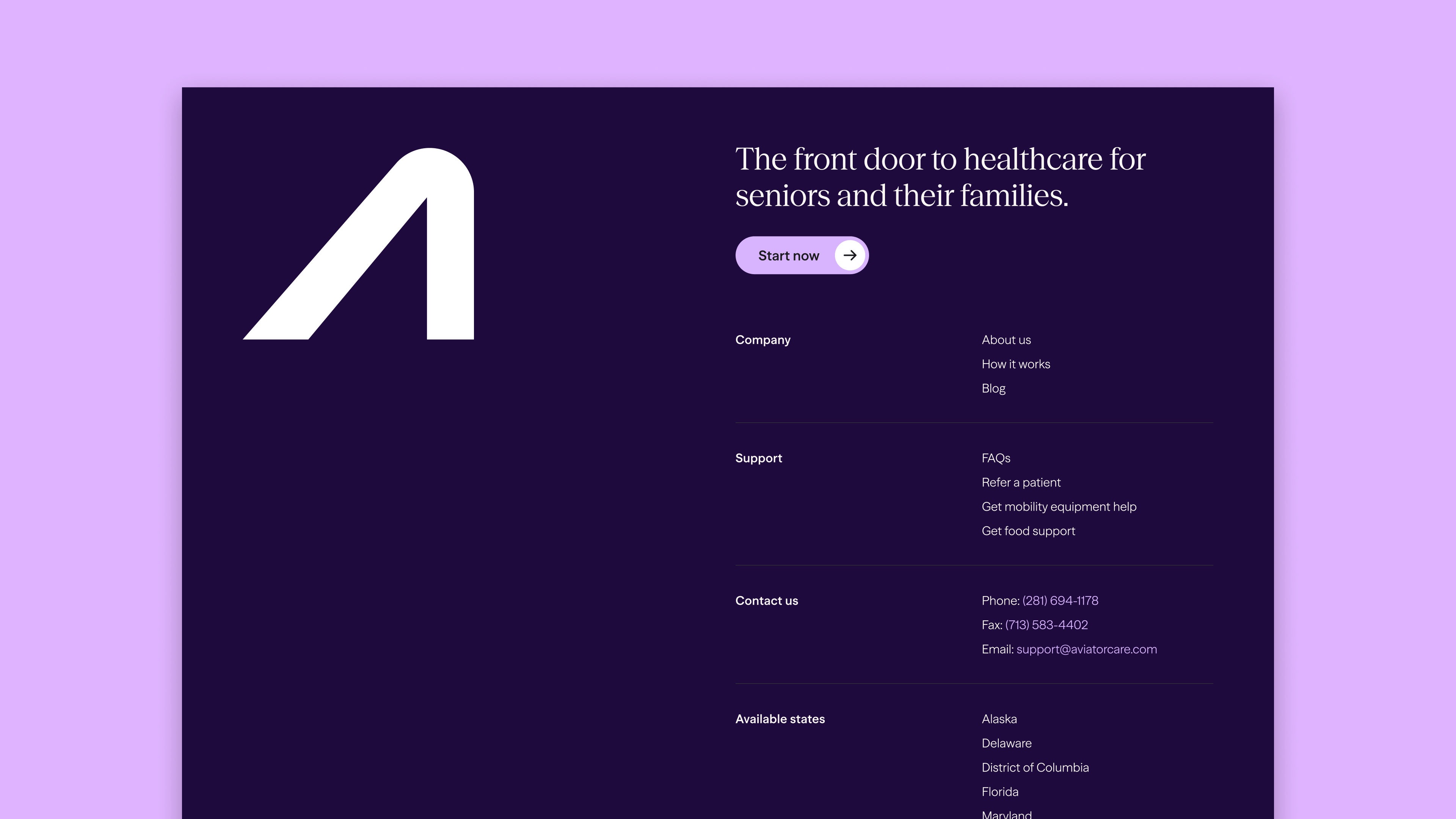
Aviator website footer with the rising A symbol
Get in touch

or follow us below