A sharp identity for a tenacious AI company
supa
Overview
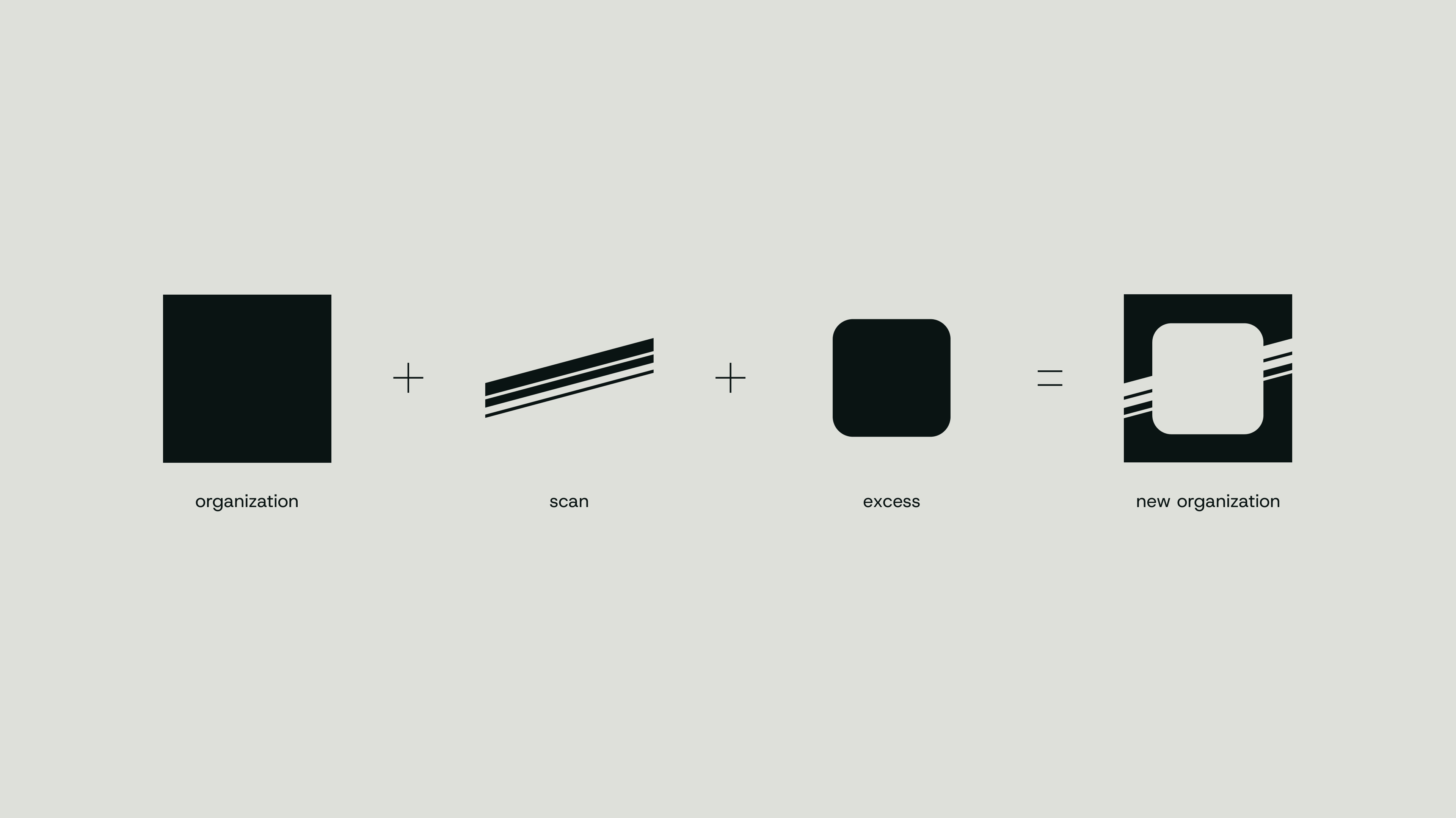
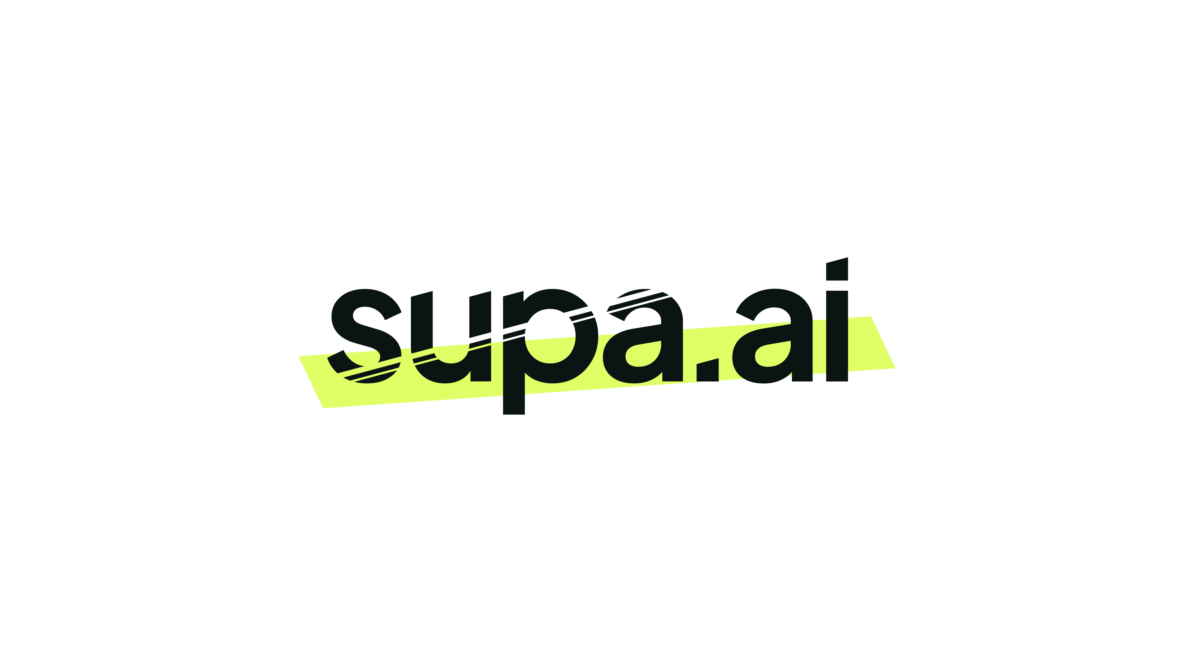
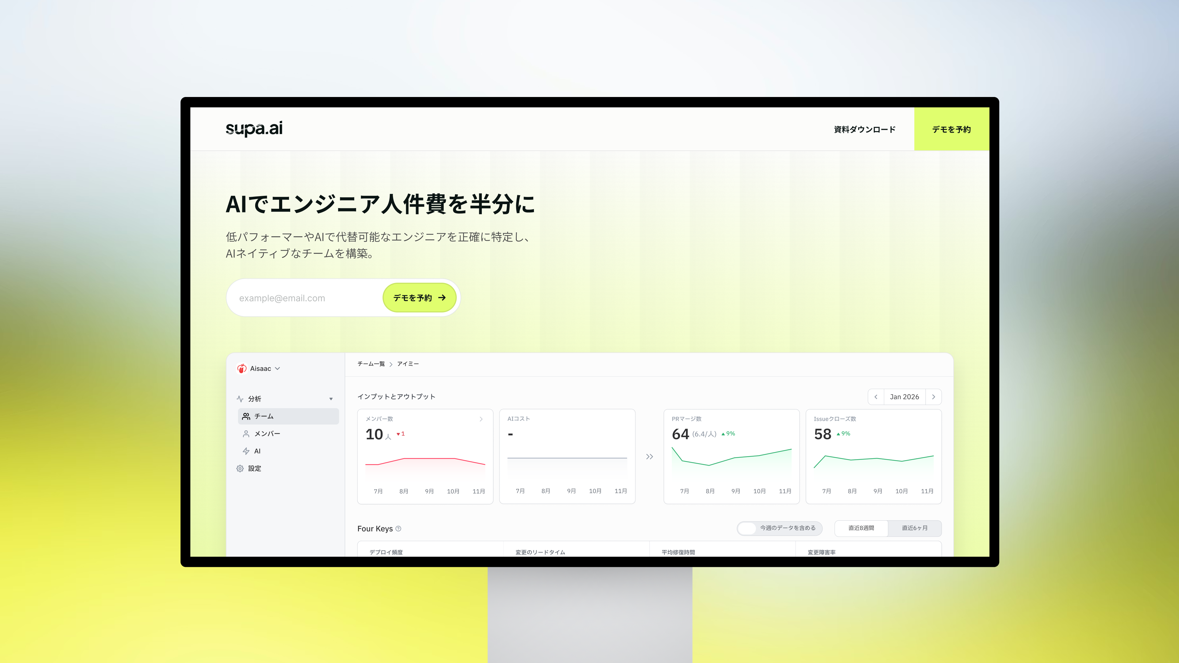
For supa, we wanted an identity that could get straight to the point, whether you saw it on a website, on a stage, or on a badge. The idea came from “supa,” a Japanese onomatopoeia for the sound of a clean cut.
We took that as a direction for the design itself: cut back to sharp type, simple shapes, and a direct voice. Those few elements give supa a distinct character across all three formats.